When I brought the work I had been developing last week to a group tutorial at the beginning of this week, I mentioned how this workload of reimagining established advertising campaigns not only pushed me behind schedule but also proved a difficult task to keep with my theme. The theme of transparency I was going for was one that asked a lot of the imagination for both me designing it and the viewer interpretting it. Through this feedback, I showed my collection of mock-ups to a tutor to try and better my process, as well as discussing alternatives.
Through evaluating my progress and acting on feedback given, I decided to try experimenting with an alternate design to see if, not only could it be a viable option in terms of completion before the deadline, but also if it efficiently fit my own set criteria for this project's outcomes.
Going back to an earlier idea, I started to develop a more abstract route to my idea of forcing transparency on brands I will be targeting. The above idea consisted of using the shape of a big brand's logo and filling the shape with words that related to unethical or immoral flaws the targeted corporations are guilty of. Through this development, I was able to fully utilise my research into scandals that surround big name corporations and exhibit them in a clearer way. Being able to more clearly convey my message, I found it a lot easier to get a clearer grasp on how I wanted to visualise my theme.
To start with, I went with the brands of Nestle and Coca-Cola and digitally created a mock-up of the first letter of each to try and get a clearer look into how this idea would end up looking. For both designs, I also used fonts that each brand uses as their primary typeface, with Gotham for Coca-Cola and Helvetica Rounded for Nestle to stick with the theme of the brand displaying a transparency of its own flaws.
As I had just drastically changed my visual outcome idea, I thought it best to get people's opinions on my previous idea and the one that I have just started developing. The response from the various people I asked from my group was that this new idea had a much more direct approach to conveying the meaning of my campaign and had a stronger aesthetic quality as well.
With this idea in mind, I wanted to then focus on creating my campaign around this, which gave me the idea of altering the idea of a super brand that produced the old idea of reimagined advertisements by moving in a more art movement type of way. Through this, I came up with creating a brand that relied on social media to project the visuals I will be producing.
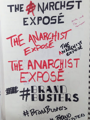
For the name of the campaign, I tried to focus on the idea of the philosophical theories in play with this campaign as well as the idea of exhibiting the hidden secrets of big businesses. From a large list of names I thought of myself as well as some suggestions, the names I started sketching up were Brandbusters, The Anarchist Expose, Transparency and hddn actvsm.
Again, focussing on potential user feedback, the names and also visual sketches that people liked the most were Brandbusters and hddn actvsm. Digitally developing these, I preferred the look of the bold graffiti-style aesthetic as I believed it better symbolised the subversion of corporate advertising. Through evaluation of the digital designs, I found myself fixed on hddn actvsm as it summed up the philosophy of my campaign pretty well and the aesthetic of the typography was big and bold which further added to the effect I wanted.
Deciding on producing three visuals, I set out to create them, all the while deciding on how I wish to display them. Through this design process, I decided on producing three posters which could be used as large billboard-type advertisements as well as sold as posters. The reason for this decision was that, after producing two of the pieces, and experimenting on the layout of each, I found that the artboard I had designed them on in Photoshop (1920 pixels x 1080 pixels) fitted the design well as it portrayed them with a bold impact.
colour experiments
layout experiments
Looking back on the progress of this week from when I am writing this, I felt I efficiently produced the designs with no rush and managed to stick to my action plan well, and have a clear idea of how I wish to exhibit my work. At the end of this week, I now also have three strong visuals that I wish to experiment with but have a fairly limited amount I wish to do with them. Out of all the weeks so far, I felt that this has been one of the most productive weeks and has set me back on schedule.


No comments:
Post a Comment