Sunday 31 January 2016

PROJECT 12: Alphabetype

For the second project of this 2 week mini-project series, I looked into another type-based brief. This project asked us to design a complete alphabet based on a particular theme. Looking into examples of fonts and types, I began experimenting with how to portray my chosen theme (tribal) and how I could keep in line with a functioning font. The reason for this came through my research into type and how, despite theme, shape or form, the consistent factor with font design is that they are still able to fulfill the requirement of legible lettering.


Through my initial ideas, I performed a bit of brief market research into what people liked the look of. I asked the people I surveyed which font they would most closely connect to my theme but also would be aesthetically effective as well as functioning as a typeface.


I drew the above alphabet out and started to briefly experiment with colour. The outcomes, as shown below, show what would the font actually look like if it were to be used professionally. There are two different modes to this font, one being an outline and the other being block as this seemed like quite a good way to keep the font open to use in design.


I was quite happy with these outcomes as they fitted my theme well, but I would have preferred to spend a bit more time in Illustrator refining the shape of the lettering.


Tuesday 26 January 2016

PROJECT 11: Letter Transformation

For the next 2 weeks, we had been given 6 different briefs of which we had to choose 3 to complete by the deadline. With all the briefs being quite different to each other in terms of design processes and areas of design, I focused on the briefs that connected most with what I enjoy and also do well in.

I decided for the first brief, I was to focus on the one titled "Letter Transformation". The reason behind this was my strong interest in the use of typography to portray meaning and/or a visual metaphor and what better way to do this than to show how a letter can be morphed into a shape/image to resemble what it stands for, for example: A for Apple, H for House, etc.

As this was quite a short project, there was not that much time to do a full design process in depth. I ended up with quite a minimal amount of development in my work due to the extent of my experimentation taking too long.


If I were to repeat this project, I would have spent more time focussing on the construction of the type and the specific transformation between each step.

PROJECT 10: Campaign

Our tenth project on our Foundation course was to do with producing a visual campaign devised to inform and communicate a topic on a personal, community, local, national or even global level. The basic idea of a campaign is to publicise and bring attention to a problem/issue.

From the start, my mind was set on the subject of mental health for my campaign, as it has both personal connections through knowing those who suffer from mental disorders and also personal issues with the treatment those people go under and how it is too general. 

I started by researching some general symptoms and treatments for three disorders: Borderline Personality Disorder; Bi-polar Disorder and Schizophrenia. With this information, I then cross-examined it with a few personal case studies found online as well as my own self-written account of experiences I've had with people affected by mental disorders, in particular one with a long-term girlfriend.

Girlfriend of 9 months already diagnosed with Bi-polar disorder due to evidence from counselling and genetic factors then diagnosed with Borderline Personality Disorder (BPD). Reliant on medication already at 17, now given more medication and intensive counselling. After reading heavily into both disorders, I looked into the medication she had been on.There had been consistent incidents of self harm on her part before and after medication and she would always return from counselling worse off.Her own words on the effect of her treatment:"The medication was like a pill-form temporary lobotomy""The fact I was on medication made me feel even more pathetic and helpless""They seemed in a rush to diagnose me and medicate me but still told me it was just a phase"I asked if she ever though of not taking her medication and convinced her to try living without it.Our relationship began to falter as her BPD started blacking out large parts of time, in which it transpired she cheated on me with no recollection of the event. Due to my understanding of BPD at this time, although we broke up, we still met up frequently and she has told me numerous times that this helped her focus on the fact she wasn't worthless and that she did have the ability to function and could actually trust in someone.We got back together for another 2 months and I saw massive improvement.Upon seeing her counsellor for a post treatment recap, she was told she didn't have a severe enough case to require treatment but they recommend continuing with the medication.Our relationship ran its course to a natural end but we remain close friends and she has not had a single BPD/Bipolar episode in the entire year since that. - My own personal account on my experience with BPD and Bipolar


The idea of designing a piece to be used in a campaign connects very heavily with the idea of branding identity, as it has to be something recognisable. Looking into campaign posters from mental health campaigners and charities such as CAMH and Amnesty International there is not only a recognisable brand behind the poster but also almost always an image that either plays on a shock factor or a deeper visual metaphor that makes a viewer think about the message being portrayed. 

I started by sketching ideas using quotes from various people I knew that had been affected by mental health disorders in some way and tried to develop a visual representation or metaphor to go with them.


Above are two larger sketches i developed from initial sketches I had jotted down in my sketchbook. I decided to go with the one on the right because not only was it a clearer message in my opinion, but was also more aesthetically pleasing.

I started developing this into a poster, using it as the main point of focus.


Using Illustrator, I created vector shapes from the original sketch to maintain the cartoonesque aesthetic and am pleased with the outcome. As an overall piece, I feel the main image could have been reduced in size to make space for some information where the quote is as it is not as connected to my campaign as I would have liked it to be.

Monday 18 January 2016

PROJECT 9: Data Translation

This project was based around the idea of data translation in graphics and the idea of infographics. We were tasked with researching information and data around a topic of our own choice. I chose to focus on politics, in particular the results of general elections in the UK every four years. I used the maps they publicise of each constituencies elected party post-election from the past 50 years (1966-2015) in which there have been 12 elections.


Using these maps as well as charted data fetched from Wikipedia, I gathered information on how many seats went to each party in the elections. After this I started experimenting with the visual aspect of these maps.


I also started experimented with the idea of charting the data in visually intruiging ways. I started with creating 650 lines (one for each constituency) and coloured each one according to which party held the seat for each constituency. I also then used circles to express this graphic, using the same idea.


The idea of using the lines was inspired by artist Lisa Jevbratt who uses patterns and abstract visualisations of data. Although a nice idea, this piece was not clear enough to portray any meaning, and the circles seemed clearer and still aesthetically effective. I started experimenting with ideas on how to present the grid of circles and how it could portray the difference in each election over the 50 year range. The thought of an animation of each image seemed like it could work so I started experimenting with the design of the transitions between each image. I started by creating a warped version of each image, and used them as a fade transition. The result is below:


I then wanted to develop an alternative way of presenting this information, and decided to use a more uniform pattern and made a grid of each image, with the year of each graph underneath each image.


Through the simple change into having the final piece be separate still images, I believe the abstract look of the grids put into a grid like above is a nice concept which worked surprisingly well.


Monday 11 January 2016

PROJECT 8: Wayfinding and Mapping


This week the focus was on using graphics to design a map of whatever we wanted. The use of maps is, for many, a crucial part of travelling and so a map also needs to be designed in a way that is clear and concise to be a functioning tool for travel.

Looking at some examples, it is clear that maps are used in a very wide range of mediums due to the hugely varied modes of transport, locations and distances. Maps can be used from plotting a journey by car, plane, foot and bicycle nowadays as well as being used in geographical studies. A prime example of the difference between types of map is the one displayed on every tube station for London Underground and one used to work out foot/vehicle direction such as the infamous A-Z.


Due to the freedom of choice on the topic of the map, I started brainstorming ideas of routes/journeys/locations I could create a map for that would be personal for me. Due to living in the same borough my whole life, I know my way around extremely well so decided to work around my local area and create a map that could be used to find various locations around my borough. I started thinking of using the location of my friends houses around my area, and started by plotting them out on Google Maps


Developing a stylistic aesthetic similar to the London Underground map, I first experimented with how to lay out the route and whether I should use a more freehand approach to the uniform approach that the Underground map is famed for.


Drawing this experiment out both excercised my creative approach to expressing a visual representation of date but also exercised my ability to work with utmost precision to effectively communicate data that needs to be displayed completely accurate.


Wednesday 6 January 2016

PROJECT 7: Manifesto

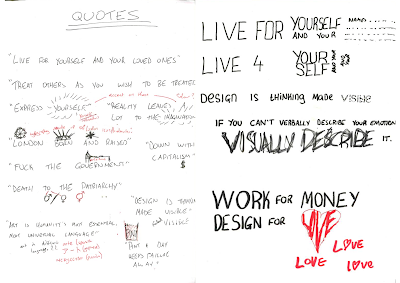
Over the Christmas break, we were set a project to create a manifesto based on our self, displaying a visual and verbal communication of our aspirations, philosophies and backgrounds. I attempted to think of quotes based on my ideology and my aspirations, as well as my overall personality and how it connects to my passion for graphics and the outlook I have on life.


This project helped with the idea of using typography to convey a theme and meaning on top of the original theme and meaning portrayed by the words used. Due to this project being based over Christmas, which was 2 weeks long, it was still a very limited time to get every part of this design process done. Thankfully, because of the theme of mine being more personal to my ideology instead of on my background, I was able to construct a few ideas of what to put in the manifesto without having to do to much research.